Contact Us

We’d love to hear from you. Feel free to ask questions, send love notes, or simply subscribe to our email list.


150 East Cordova Street
Vancouver, BC, V6A 0E7
Canada

R9 Type+Design is an independent type foundry from Canada. We specialize in modern and contemporary typeface/font designs.

Aqueo™ Cylindrical Display Sans Font Features & Specimens

Aqueo™: The Cylindrical Display Sans Serif with a Little Zing!

Aqueo™ Font Features

Aqueo™ is a versatile display sans serif font family born from a moment of simple inspiration. On a beautiful summer day, as the soft morning light shone through a glass of water on my desk, the cylindrical wireframe of the glass inspired me to create this typeface. It was that simple flash of inspiration that became the core of this design. I'm proud to introduce Aqueo, a contemporary typeface that captures the transparent simplicity of its inspiration. This design philosophy, rooted in that fluid, adaptable origin, is infused into every detail, ensuring a perfect balance between form and function. Aqueo is delivered in 6 weights and 12 styles, and over 1,350 glyphs per style.

Animated GIF showcasing Aqueo's core feature: The looping transition between the Standard (traditional) and Stylistic Alternate (quirky) uppercase sets for A, E, and U in both Roman and Italic styles.

Aqueo™ comes with virtually two looks for the uppercases, the traditional and the quirky.

Animated GIF showing Aqueo's cylindrical wireframe structure and the design detail of the one-sided half-rounded corner, demonstrating the font's unique construction.

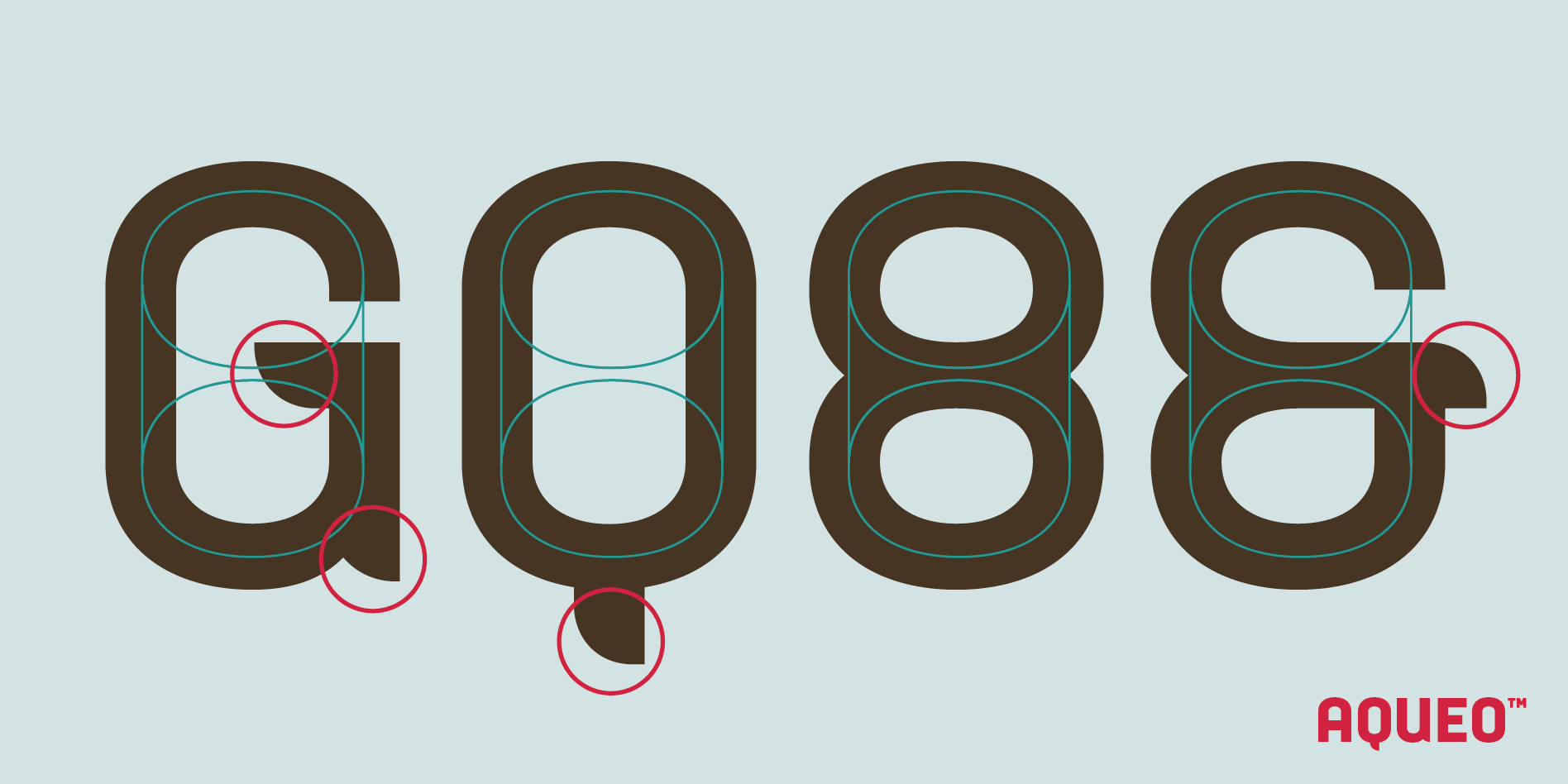
Aqueo™ design is inspired by the cylindrical wireframe of a water glass.

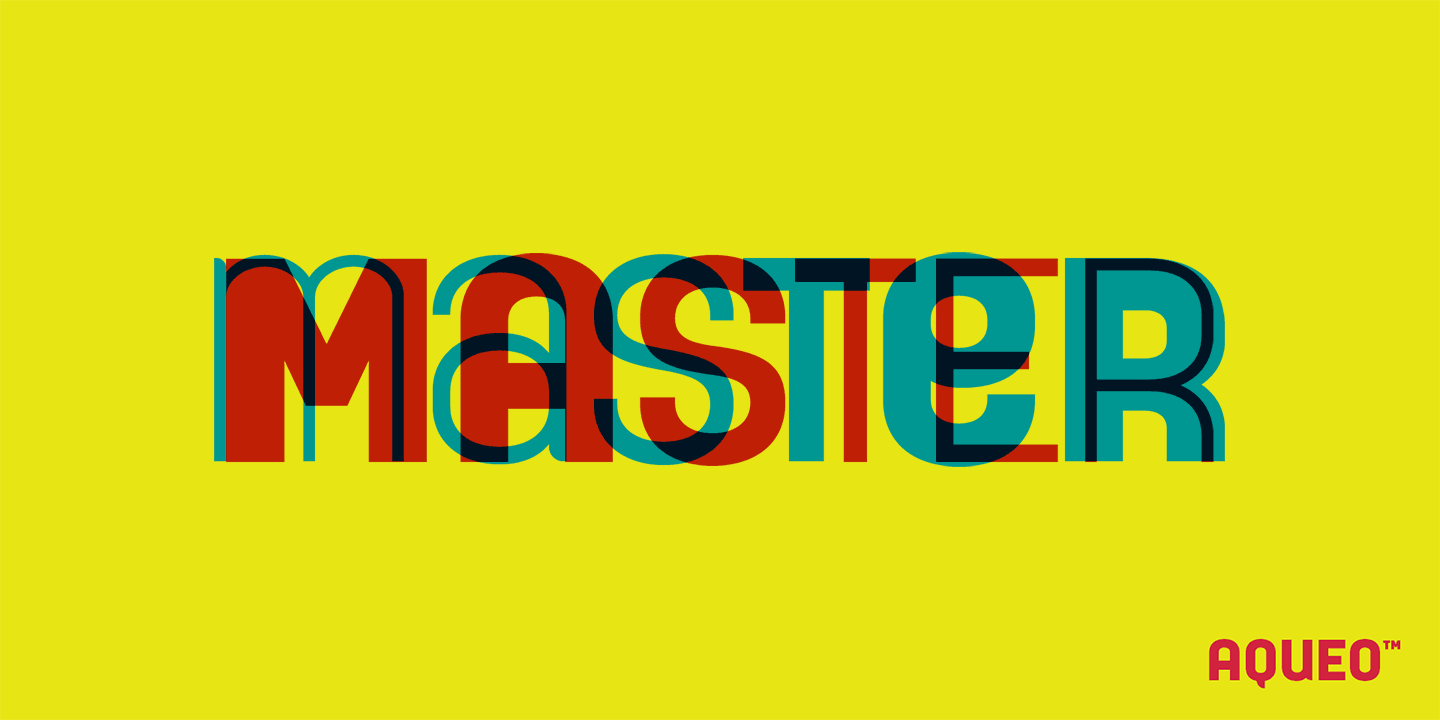
Two Personalities, One Font Family

Aqueo™ gives you powerful creative control with two distinct stylistic sets built directly into the uppercase characters. This functionality maximizes your utility while maintaining the same geometric form across all 12 styles.

The functional core of the entire Aqueo family is built with extensive OpenType features, including discretionary ligatures and mark alternates, designed for typographical finesse and consistency.

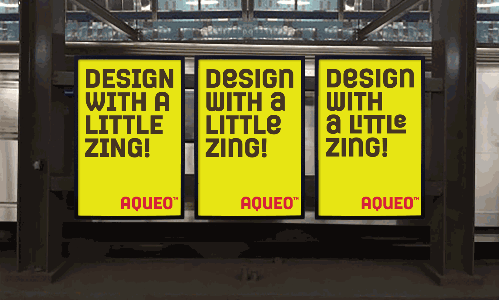
  • The Standard Set provides the default, geometric structure. Its traditional forms exude confidence and dependability, making the Standard Set perfect for structured layouts and high-impact corporate branding.

  • The Stylistic Alternate Set delivers the form—a playful, quirky, and whimsical look. Designed with unorthodox elements based on lowercase forms, you can instantly shift the font's mood for expressive logo design and bold packaging.

Aqueo also features extensive multilingual support for over 200 Latin-based languages, including Vietnamese.

Aqueo Cylindrical Geometric Sans Serif font features overview chart, highlighting 6 weights, 12 styles, 1,350+ glyphs, 150+ discretionary ligatures, 80 UX/UI icons, and 200+ language support.

Aqueo comes in 6 weights, 12 styles and 1,350+ glyphs per style. It is also packed with over 80 essential icons, each in three styles, 150+ discretionary ligatures and supports 200+ languages, including Vietnamese.

Visual showcase comparing Aqueo's Standard and Stylistic Alternate uppercase characters (A, E, M, N) across different weights and Roman/Italic styles, emphasizing the font's design versatility.

Side-by-side detail of the Aqueo Standard vs. Stylistic Alternate characters (A, E, M, N) in various weights and Roman/Italic styles, highlighting the two distinct personalities.

Key Aqueo font glyph sample chart, highlighting Stylistic Alternates in red and Case-Sensitive Forms in turquoise. Shows uppercase, lowercase, numbers, currency, and primary Latin Extended characters.

A key glyph sample chart showing uppercase, lowercase, numbers, symbols, and punctuation. Stylistic Alternates are highlighted in red, and Case-Sensitive Forms are highlighted in turquoise.

Animated GIF showcasing Aqueo's six Roman weights overlaid, demonstrating the quality of the letterforms drawn from individual master sets (not interpolated) to maintain consistency across the Standard and Stylistic Alternate sets.

Each Aqueo font weight/style has its own master font to ensure the accuracy of the letterforms.

Loaded with OpenType Features for a Streamlined Workflow

The functional core of the entire Aqueo family is built with extensive OpenType features, including discretionary ligatures and mark alternates, designed to improve your user experience and streamline your workflow.

  • Extensive Ligatures: Over 150 discretionary ligatures and their stylistic alternates, providing detailed typographic control.

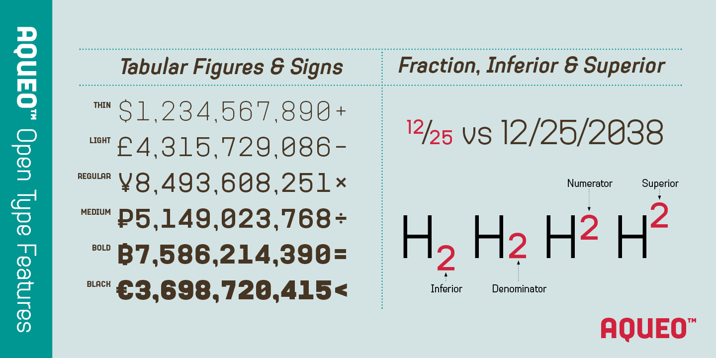
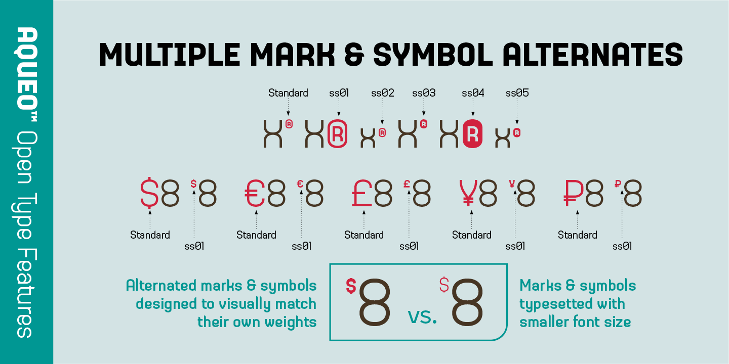
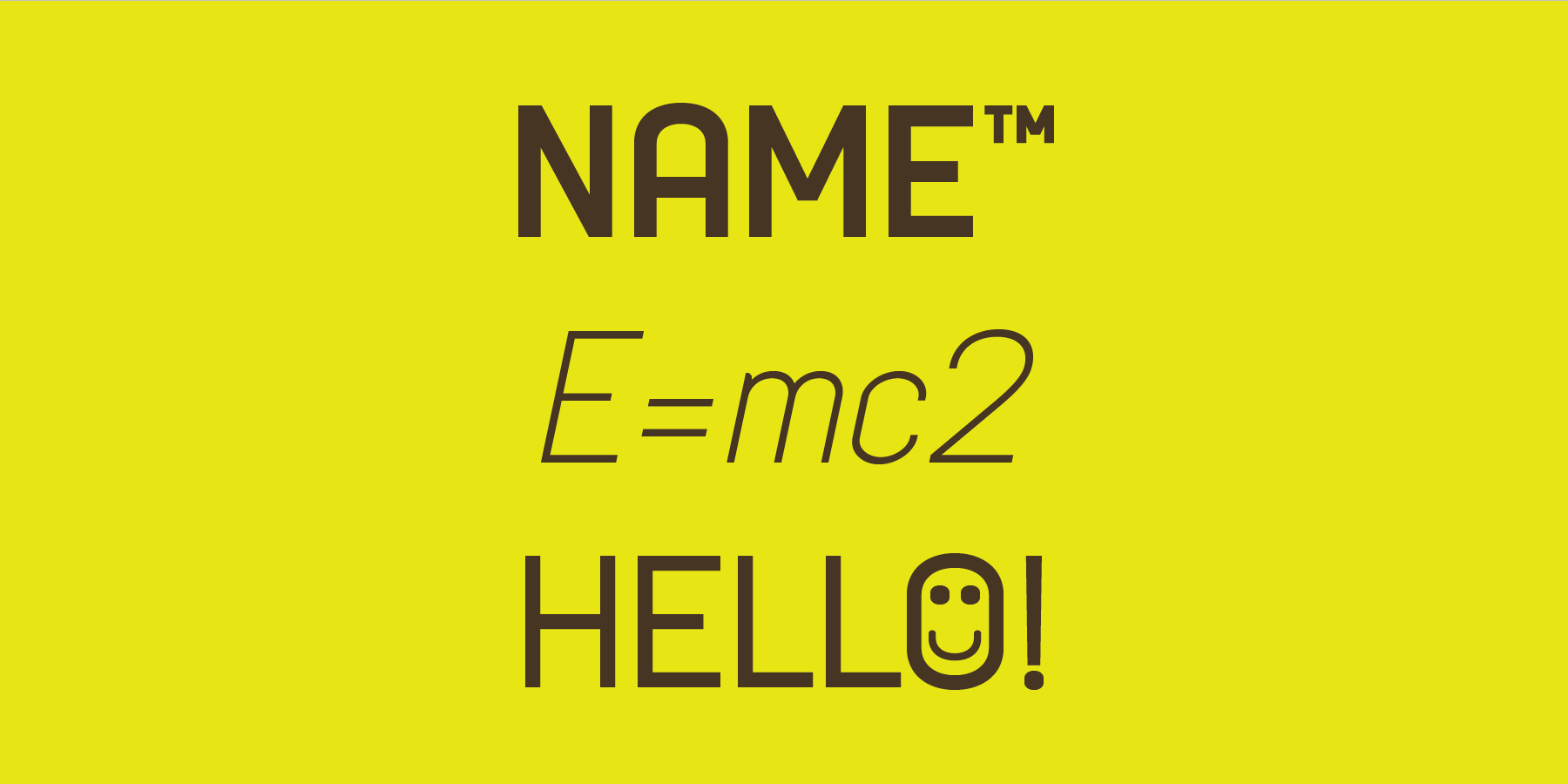
  • Case-Sensitive Symbols: Marks, punctuations, and mathematic symbols included for precise typesetting.

  • UX/UI Icons in 3 Design Options: Over 80 essential icons included, saving you the time & hassle of sourcing another icon font.

If you're looking for a unique contemporary typeface, try Aqueo™ on your next packaging, logo, or UX/UI project today!

Visual showcase of Aqueo's extensive OpenType discretionary ligatures, showing both the Standard Set (Brown) and the Stylistic Alternate Set (Yellow), demonstrating advanced typographical control.

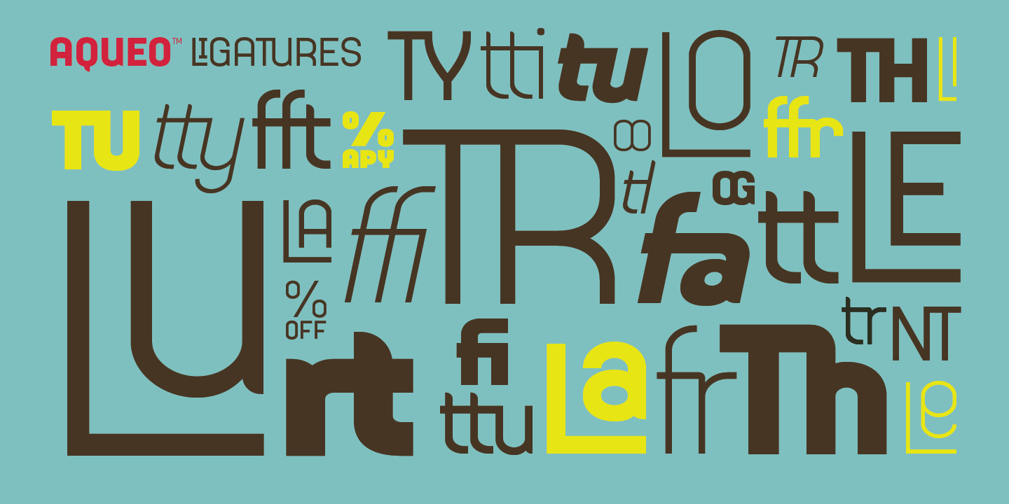
A showcase of Aqueo's extensive discretionary ligatures (over 150 included) and their stylistic alternates, available across all 12 styles. Brown indicates Standard Set of discretionary ligatures, while Yellow indicates the Stylistic Alternate ones.

Animated GIF showcasing Aqueo's 20 multilingual ampersand alternates, demonstrating how the symbol can be replaced by the actual word for "and" (e.g., AND, UND, E) in different languages for contextual accuracy.

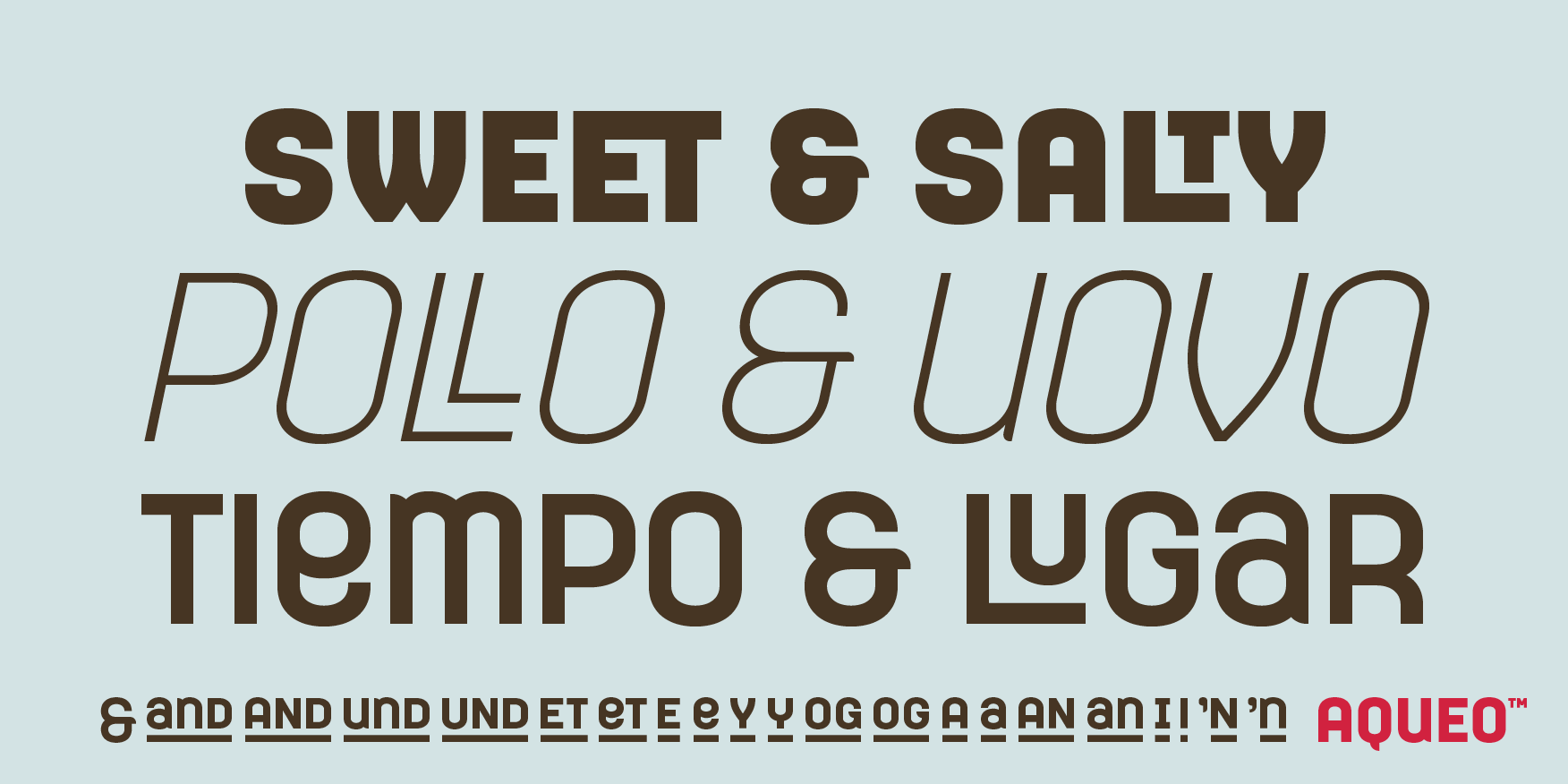
Aqueo includes 20 multilingual ampersand alternates, allowing the symbol to be replaced by the word for "and" in languages such as English, German, and Italian.

Animated GIF showcasing 80 essential UX/UI icons, including media controls, navigation, and settings symbols, which transition between three different design styles for complete versatility.

Aqueo™ features over 80 essential UX/UI icons, each in three design options.

Demonstration of OpenType numeral features: Tabular Figures (for data alignment), Fractions, and dedicated Inferior/Superior numbers for technical and mathematical typesetting.
Visual guide to Aqueo's 10 OpenType Bullet Alternates (including asterisk, heart, and checkmark) and the Case-Sensitive Punctuation, demonstrating how marks adjust position for uppercase text.

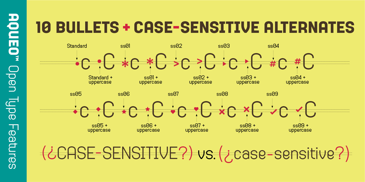
We added extra bullets alternates, their case-sensitive set, and many other features so you can typeset with breeze.

OpenType demonstration of multiple alternates for currency symbols (such as $ and €), and registered/trademark symbols, matching the weight of the surrounding text.
Animated GIF showing how to activate Aqueo's discretionary ligatures: highlighting text (like %OFF) and selecting the alternates for a quick, professionally typeset result. This also works for fractions & case-sensitive punctuations.

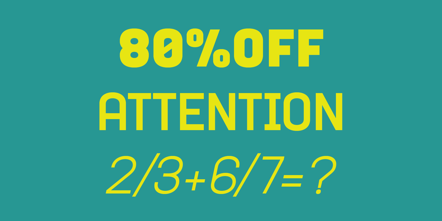
OpenType features in action: This animated example shows how discretionary ligatures, like the stacking '%OFF' symbol and fractions, can be accessed instantly in OpenType-supported software like InDesign.

Animated GIF demonstrating the quick Contextual Selection method in OpenType software to apply Stylistic Alternates in place of Standard glyphs (N, A, M, E) and activate Superior Numerals (converting '2' to a superscript)
 
Go to Aqueo Glyphs & Pangram
I want to buy Aqueo Fonts
 

Aqueo™ Type Specimen

Download Aqueo Type Specimen
Animated GIF of a skytrain platform showing three posters side-by-side, comparing the visual impact of Aqueo Bold's Standard glyphs, Stylistic Alternate Set 1, and the final look with Stylistic Alternates plus discretionary ligatures.

LEFT: Aqueo™ Bold standard glyph | MIDDLE: Aqueo™ Bold with the alternate glyph set 1 | RIGHT: Aqueo™ Bold with the alternate glyph set 1 + ligatures.

Large-format subway poster mockup showcasing Aqueo's Standard glyph set in a bold headline, specifically highlighting the seamless integration of the discretionary LI ligature for polished display typography.
Large-format poster featuring a quote by Lyndon B. Johnson, "Peace is a journey of a thousand miles and it must be taken one step at a time," typeset in the powerful and impactful Aqueo Black weight.

A quote from Lyndon B. Johnson typeset in Aqueo Black standard set 1

Animated GIF showcasing Aqueo's 12 styles in action, comparing weights from Thin to Black, and demonstrating the integration of Alternate Set 1 and ligatures in large-scale display typography alongside Light body copy.

TOP LINE: Aqueo™ Thin | MIDDLE LINE: Aqueo Medium (Alternate Set 1) + Ligature | BOTTOM LINE: Aqueo Black (Alternate Set 1) | Body Copy: Aqueo™ Light

Editorial design showing Aqueo font paired with a classic botanical illustration of citrus trees. The headline, "FRESHLY SQUEEZED ORGANIC CITRUS JUICE," shows selective application of a stylistic alternate 'E' glyph for granular typographic control.
Bright yellow poster mockup featuring "LEMON INFUSED WATER" typeset in Aqueo's stylistic alternate set. The image highlights the distinctive alternate glyphs (A, E, I, U) and the complementary discretionary LE ligature for a cohesive display look.
Retail packaging design mockup for an "Energy Supplement" named PYRO. The letter O is replaced with a fire icon from Aqueo's 80+ integrated icon set, demonstrating all three available alternate icon styles in the top corner.

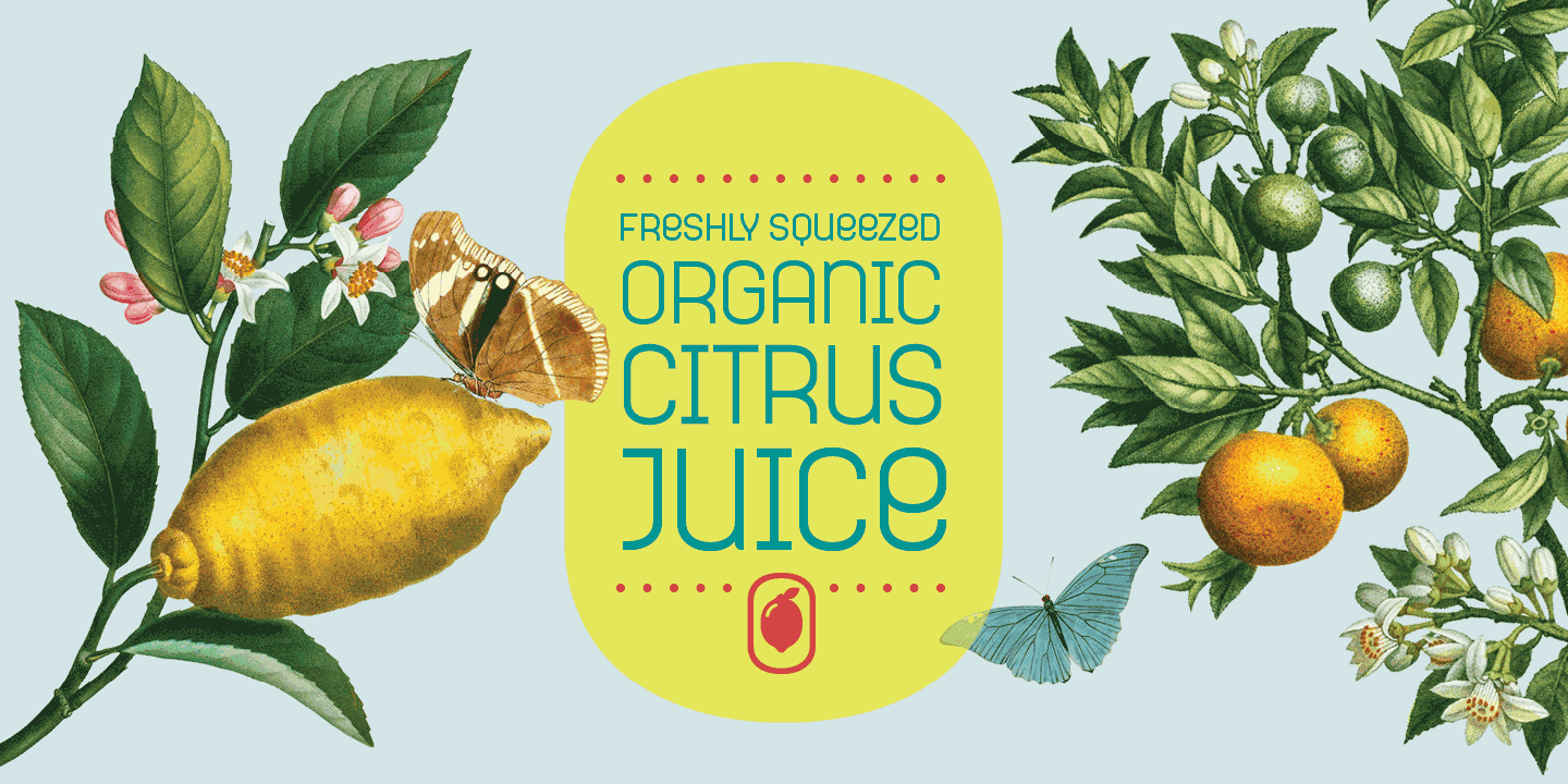
Image of Aqueo in a mock-up packaging design project. Notice the O is substituted by a fire icon, one of the 80 essential icons that came with the font. In the top right corner, show all three styles available for each icon.

Large-format poster specimen featuring an old-fashioned bicycle, showcasing Aqueo's bold display type and multilingual support (BICICLETA, FAHRRAD, VÉLO). The body copy is fully legible, accented by the included Globe and Map Pointer UI/UX icons.
Book cover mockup for "The Girl and the Attacking Cuckoo," set in Aqueo type. The title highlights the use of the discretionary OO ligature, demonstrating the font's suitability for high-impact, modern editorial design.

A book cover design, "The Girl and the Attacking Cuckoo." Featuring Aqueo's discretionary ligature "OO"

Abstract type specimen showcasing Aqueo's cylindrical geometric forms, using high-contrast colors and extreme layering of various weights. The design integrates the Home UI/UX icon within the large display text to demonstrate font-icon compatibility.
Animated GIF of a responsive gastronomy website. Aqueo is used for navigation and headlines, including the word "G A S T R O N O M Y" with integrated Burger and Wine Glass UI/UX icons. The animation demonstrates smooth navigation between screens.

Aqueo is a fantastic typeface for your web design projects.

Animated GIF demonstrating Aqueo font in an interactive web FAQ accordion. The pointer clicks the chevron icon to expand the answer, proving Aqueo's performance and icon integration for essential UI/UX components.
Multilingual type specimen demonstrating Aqueo's 200+ language support, featuring words in German and Vietnamese. The design highlights the discretionary LA ligature and the Musical Note icon replacing the letter O in LA BOHÈME.
 
Go to Aqueo Glyph Tables & Pangrams
Love it! I want to buy Aqueo Fonts