STEP 3: A Beginners’ Guide to Kerning Your Fonts
Tana Kosiyabong
When I was still in design school, I had a fantastic opportunity to study typography with an exceptional graphic designer and a One Club Hall-of-Famer, Rob Lawton. He taught me to kern type by hand, not on computers. I had to trace letterforms on vellum paper and adjust kerning manually. If I made a mistake, I pretty much had to start the entire sheet all over again. In retrospect, the hands-on approach helped me understand kerning in-depth and never forget what I learned. After all, this skill has served me well for the past couple of decades of my graphic design and art direction career.
However, it was not until I started working on my first typeface that I realized the complexity of kerning a font. As a type designer, you not only have to deal with the front end of kerning the way a graphic designer or an art director does, but you also need to make sure the back end of it is well-organized. From my perspective, there are four major steps to kerning a typeface:
SETTING THE SIDE BEARINGS
The first step in kerning is not about pairing, but about setting the default spacing for a single character—this is called Side Bearings. Every glyph has a left side bearing (LSB) and a right side bearing (RSB).
The LSB and the RSB are the space allocated to the respective sides of each glyph. Setting proper and consistent side bearings will help reduce unnecessary kerning pairs. Moreover, it will save you more time than you ever imagine. Trust me. I learned this the hard way while I was working on my first typeface. I obliviously rushed through the side bearings before realizing my monstrous mistake. As a result, I had to delete all kerning pairs and wasted a few weeks’ worth of work. It was a monumental step back, but much needed, to reset consistent side bearings.
The best way to start is by selecting a benchmark character. H is often the easiest and most ideal character, as its shapes are rectangular and the LSB and RSB are visually easy to control. We make the LSB and RSB of the H equal.
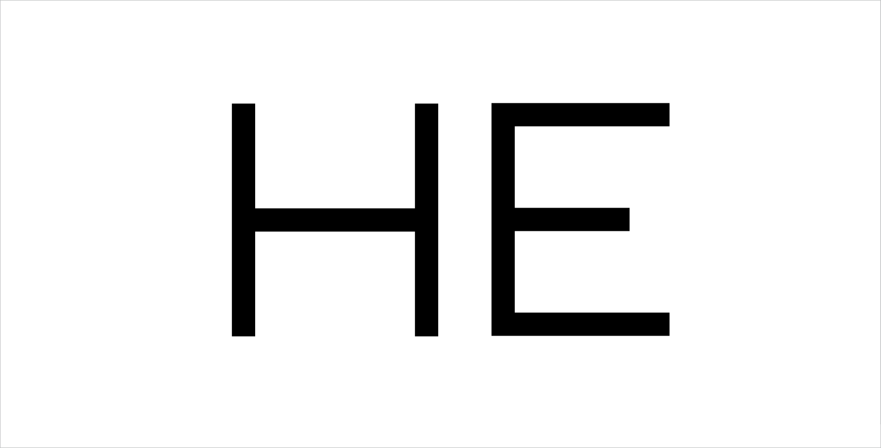
Figure 1 – The left side bearing (LSB) and the right side bearing (RSB) of H and E. [Font: Aldero™ Light]
Figure 1 illustrates that the LSB and RSB of the H, and the LSB of the E are set at the same width. However, the RSB of the E is set at a narrower width because the horizontal middle line of the E is shorter, which creates a larger negative space on the right side of the E. Therefore, we compensate for that larger negative space by setting the RSB of the E a bit narrower than the H.
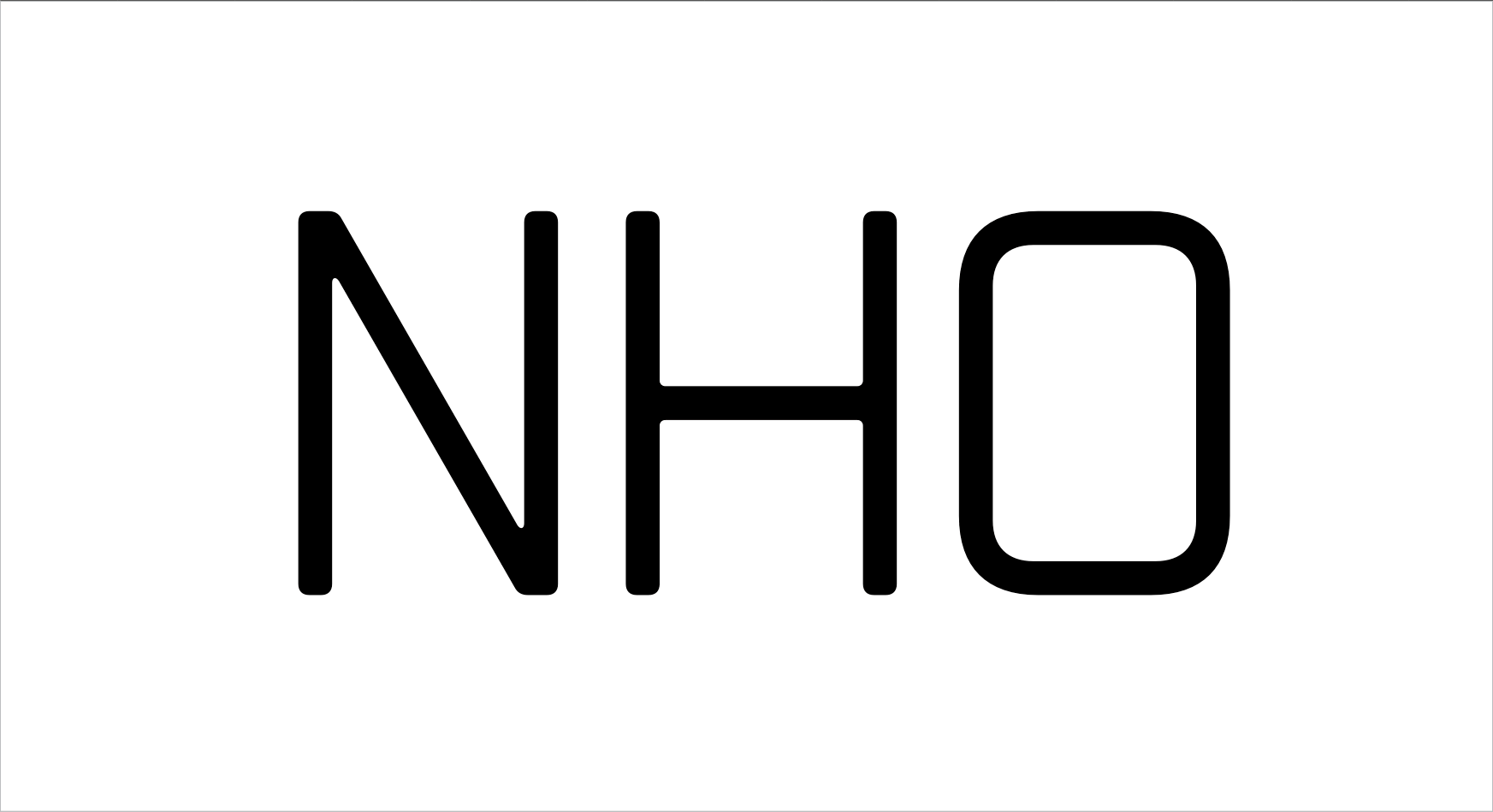
Figure 2: Keep letterspacings (green spaces) visually consistent as much as possible. [Font: Boxr™ Light]
Now, let's look at a rounder characters, like the O. In Figure 2, the LSB and RSB of the O are thinner than those of the benchmark pair, N and H, to compensate for the extra negative space at the top and bottom corners of the O. Kerning, at its core, is the art of balancing positive and negative space to achieve visual consistency, even if the measured spacing is technically uneven. If you set the side bearings well, you don’t need it to kern the HO pair.
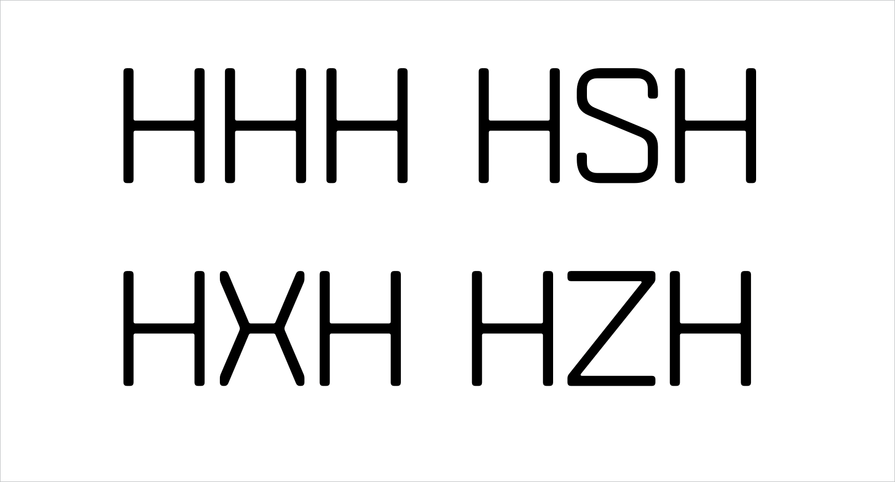
Figure 3: Examples of LSB and RSB of S, X, and Z compared to H.
The same principle applies to S, X, and Z. The S has a similar outer form to the O but with two openings. To maintain visual harmony, you should set the LSB and RSB of S slightly narrower than those of the O. The X has visually wider openings than the S, so its side bearings are set narrower than the S. And the Z has the largest openings on both sides, so its side bearings should be the thinnest. In short, the more openings a character has, the tighter its side bearings should be.
SETTING THE KERNING GROUPS
If you had to adjust kerning for thousands of pairs, the work would take forever. Thankfully, Kerning Groups make the job much more efficient.
Therefore, the second backend step you must complete before starting to kern is setting the left kerning groups (LKG) and the right kerning groups (RKG). If done correctly, all members of the same group will automatically be assigned the same kerning values for all their kerning pairs. It will tremendously save you time in the kerning process. So make sure you have thoroughly set them before you start kerning.
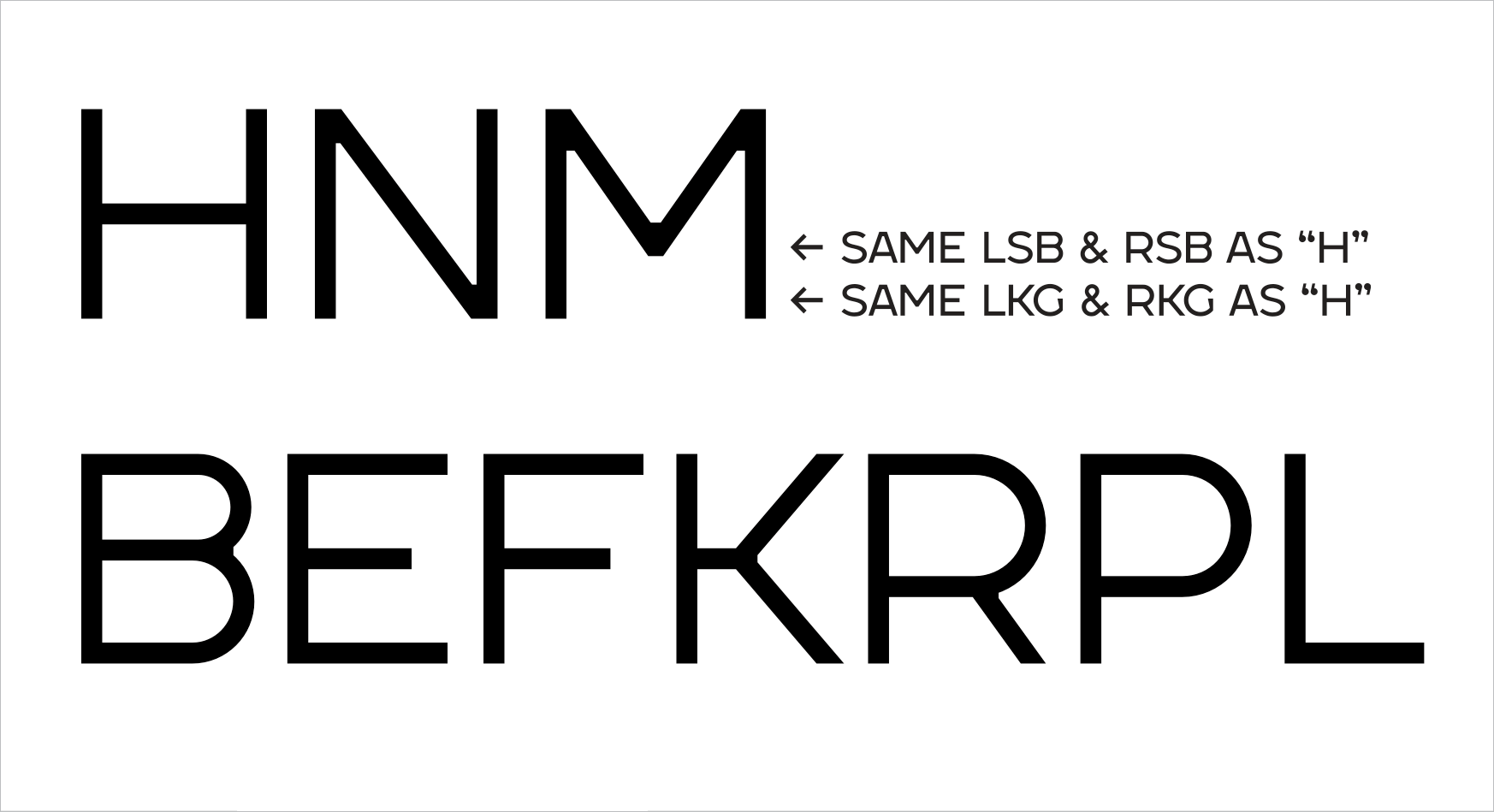
Figure 4: The top row shows the glyphs with the same LSB, RSB, LKG, and RKG. The bottom row shows the glyphs with the same LSB and LKG but different RSB and RKG. [Font: Aldero™ Light]
To set kerning group, you should look for the similarity at the left and the right edges of each letter. For example, In the top row of Figure 4, characters like H, N, M share the same LSB, RSB, LKG, and RKG. Why? Because they all have two straight vertical lines on both the left and right side, making their spacing needs identical.
In the bottom row of Figure 4, characters like B, E, F, K, R, P, L share the same LSB and LKG with the H. This is because their left side is a straight vertical line. However, their right side has different shapes, meaning their RSB and RKG values will be different. By creating groups, you only have to adjust one LKG/RKG value to affect all characters within that group, saving significant time.
KERNING PAIRS
Kerning is the adjustment of space between two individual letters. In type design, kerning is a much more complicated and time-consuming task than kerning just a few headlines. It requires consistency and persistence. As a type designer, your job is to make letterspacing for the entire typeface look as harmonious and consistent as possible.
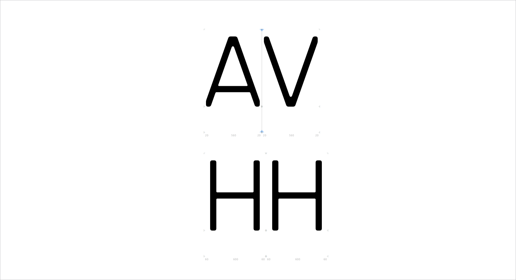
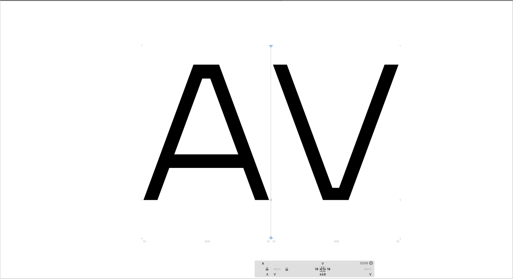
Figure 5 – Kerning pair “AV” and the benchmark pair “HH.” [Font: Boxr™ Light]
After completing both backend steps mentioned earlier, you will likely still need to kern many letter pairs. Let’s use an AV pair, in Figure 5, as an example. Even if you set the side bearings to the minimum for both characters, the negative space between them is still too broad. That’s when kerning comes into play. The AV pair requires negative kerning to tuck the V under the A, creating a visually tight and pleasing result that matches the visual space of your benchmark HH pair.
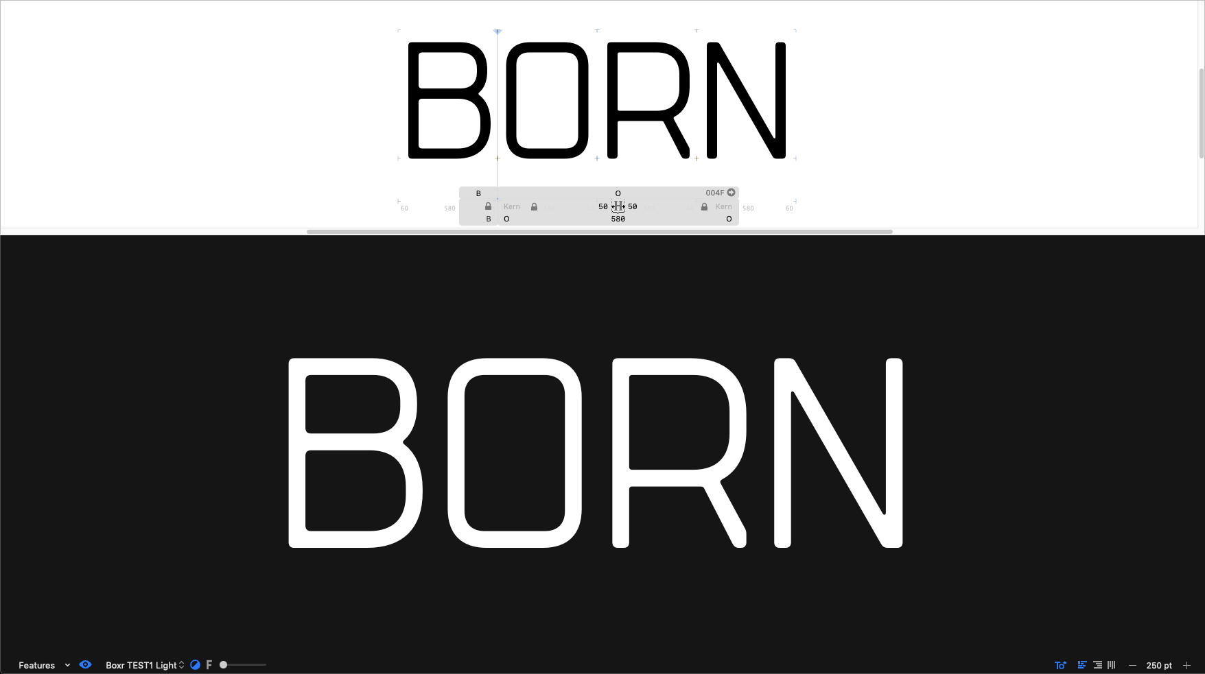
Figure 6: Three visual modes that can help improve your kerning. [Font: Boxr™ Light]
Three visual tricks to improve your kerning
The process of kerning can be taxing on the eyes, leading to fatigue and poor decisions. To help ease your kerning task, I want to suggest three tricks professional use to improve their kerning:
White type on a black background: This helps the eye focus on the negative space rather than the black shapes, making it easier to spot inconsistencies.
Upside-down type: Viewing the characters upside down removes their semantic meaning, allowing your brain to see the letters purely as abstract shapes.
Blurry type: Using a blur effect or slightly squinting helps the eye evaluate the overall volume and density of the negative space, rather than the small details.
Conveniently, for the Glyphs app users, these visual modes are built-in. So you can choose just one or any combination that suits you.
EXTRA STEPS TO IMPROVE FONT USER EXPERIENCES
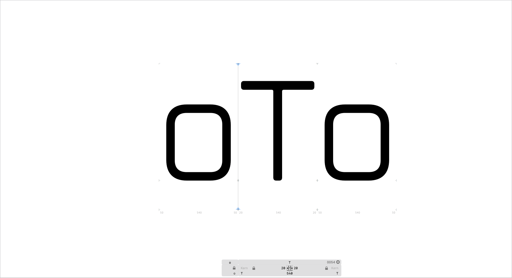
Figure 7: We kern lowercases to both sides of the uppercases, so you don’t have to. [Font: Boxr™ Light]
1. Kerning Lowercase to Uppercase
Although it is not an industry standard, at R9 Type+Design, we believe in perfecting the User Experience (UX) of our fonts. One of the ways we do this is by kerning lowercases to both sides of uppercases. This is especially helpful in mixed-case typography, such as company names like BioTech, where the spacing around the uppercase letter can look too wide if only default side bearings are used. By adding these kerning pairs (e.g., o/T and T/o), we ensure better spacing for you right out of the box.
Here is an example of a mixed-case typography mentioned above.
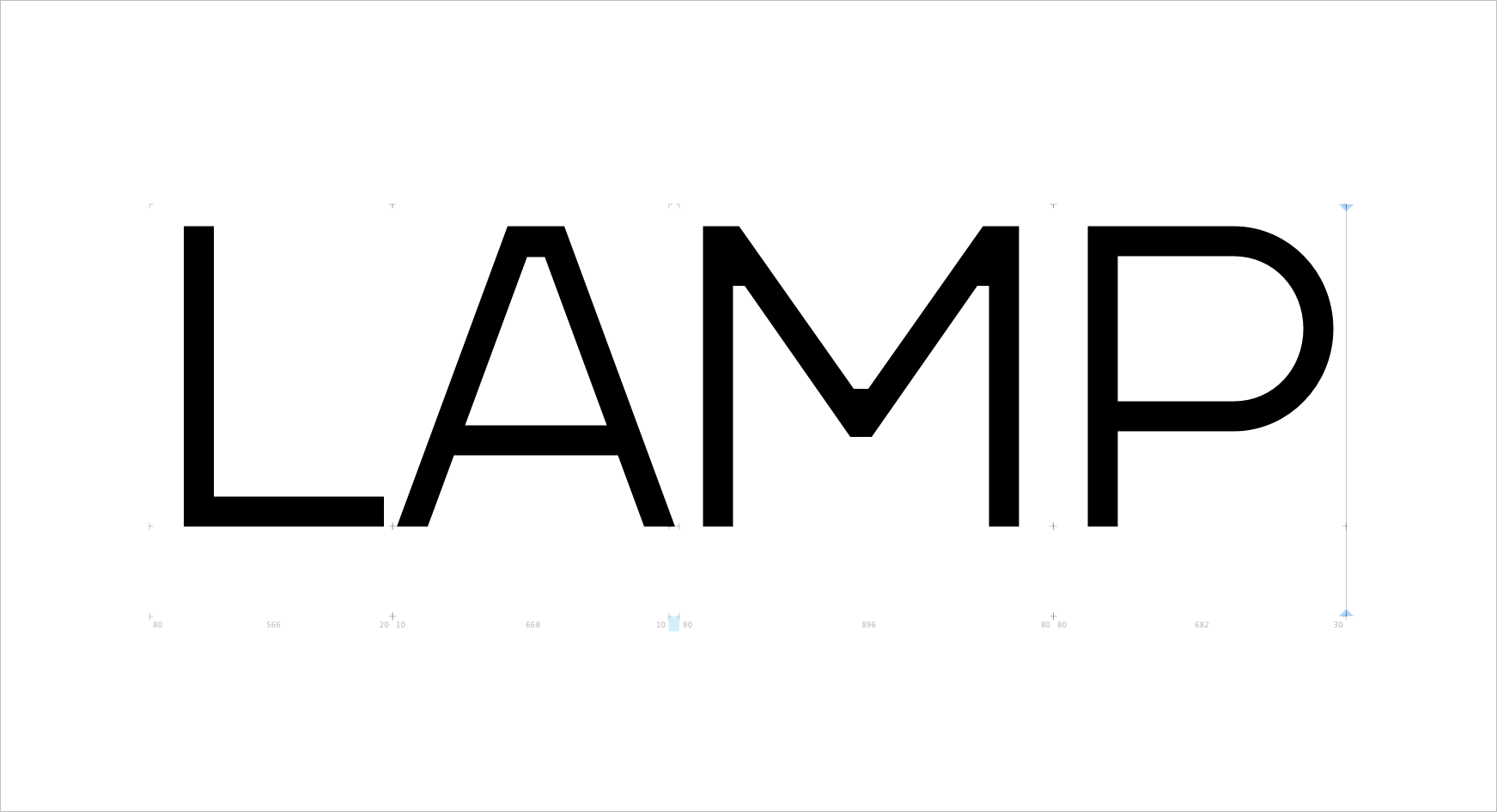
Figure 8: The Letterspacing between L and A is too large that a simple kern would make it consistent. [Font: Aldero™ Light]
From time to time, you will come across substantial negative space in a pair such as LA in Figure 8. A simple kern will not be enough to solve the letterspacing issue. Instead, you can create a discretionary ligature for such a pair as an option for your customers. This way, you can manipulate the letterform as well. But try not to overdo it. Otherwise, the L may no longer be recognizable.
2. Discretionary Ligatures
From time to time, you will come across substantial negative space in a pair such as LA (as shown in Figure 8). A simple kern will not be enough to solve the letterspacing issue, as it would cause the characters to crash or look unnatural. Instead, you can design a discretionary ligature for such a pair, which is essentially a custom glyph combining the two letters into a single character. This is an advanced technique for designers to ensure perfect spacing.

Figure 9 – Embedded kerning for inconsistent word spacing. [Font: Boxr™ Light]
3. Kerning to the Space Glyph
Last but not least, sometimes, even minor details can make significant differences. This particular one derives from my graphic design pet peeves. It is a bit annoying when I have to adjust word spacing, especially for words that start or end with A, L, T, V, Y (see Figure 9). The negative space of these characters often causes visually inconsistent word spacing. Here’s an example: the word space between "CALL TIME" might look wider than the word space between "LAUGH NOW."
My solution is to add kerning pairs to both sides of the space glyph (Unicode U+0020). Specifically, we add a negative kerning value to the L/space, space/T, and T/space pairs. Voila, problem solved for my font users! Just be mindful not to overdo it though. That’s because you must optimize for all the characters that would appear before and after the space glyph. Let’s check out this example: the word spacing of "CALL TIME" is wider than that of "IN TIME." This means that if you heavily compensate for the L and the T, it may work for that one situation, but not the others. The key is to find the middle ground kerning value that would be a good compromise.
Now that you have learned some kerning basics, it’s time for you to start practicing. Learning by doing is the best way to go. If you have more questions, feel free to check out the helpful links below. Be sure to subscribe so you won’t miss our next post. See you then!
HELPFUL TYPE KERNING LINKS:
Setting Side Bearings in Glyph: https://glyphsapp.com/learn/spacing
Kerning and Setting Kerning Group in Glyph: https://glyphsapp.com/learn/kerning
Kerning Tips: https://99designs.ca/blog/tips/11-kerning-tips
Basic Kerning Text: http://www.as8.it/type/basic_kerning_text.html
More Kerning Text: https://pangrampangram.com/blogs/journal/kern-king-is-dead-long-live-kern-king-br-the-great-template-for-kerning-types