
STEP 2: A Beginners’ Guide to Typeface (Font) Design
Tana Kosiyabong
I’m a big fan of learning by doing. So when I first started designing fonts, it was also how I learned firsthand. Type design requires time, patience, and perseverance. The more time you put into your project, the better your outcome. Designing a digital typeface involves thousands of small tasks you need to complete before your font is ready to use or for sale. But don’t let that intimidate you. Just focus on the task at hand and proceed one step at a time until you reach the finish line. Here are eight tips to help you ease into your type design journey:
1. KEEP YOUR FIRST PROJECT SIMPLE.
Imagine that you are new and still finding your way around the font software. As you design each letter in your character set, you come across several design decisions you need to make. Should the ascender of the lowercase ”d“ be as tall as the cap height, or taller? Or, how big should the apostrophe (’) be? And where should it be positioned, at the cap-height, or just a bit above? These hundreds, if not thousands, decisions can quickly pile up and eventually overwhelm you. That’s why I’d suggest that you start with a simple project.
My first typeface design project is Alio™, a mono-line geometric typeface with rounded ends. It’s easy to draw, and I can build upon it as I gain more and more experience. To ease the learning curve, I used Adobe Illustrator to draw each letter; then, cut and paste each of them to Glyph, my font software of choice. That said, I would only recommend this just to get the ball rolling (if you’re familiar with Adobe Illustrator). It does not intend for the ongoing design practice. Glyph has its own powerful vector drawing tools once you learn how to use them. So it’s best to gradually switch to Glyph’s native drawing tools sooner than later.
2. LEARN THE BASIC ANATOMY OF TYPE.
You should at least have some basic knowledge of type anatomy (e.g., cap-height, x-height, ascender, descender, etc.). If you don’t even know what I’m talking about, perhaps, you should spare an hour or two to familiarize yourself with such terms. They will come in handy sooner than you expect. See useful links at the bottom to learn more.
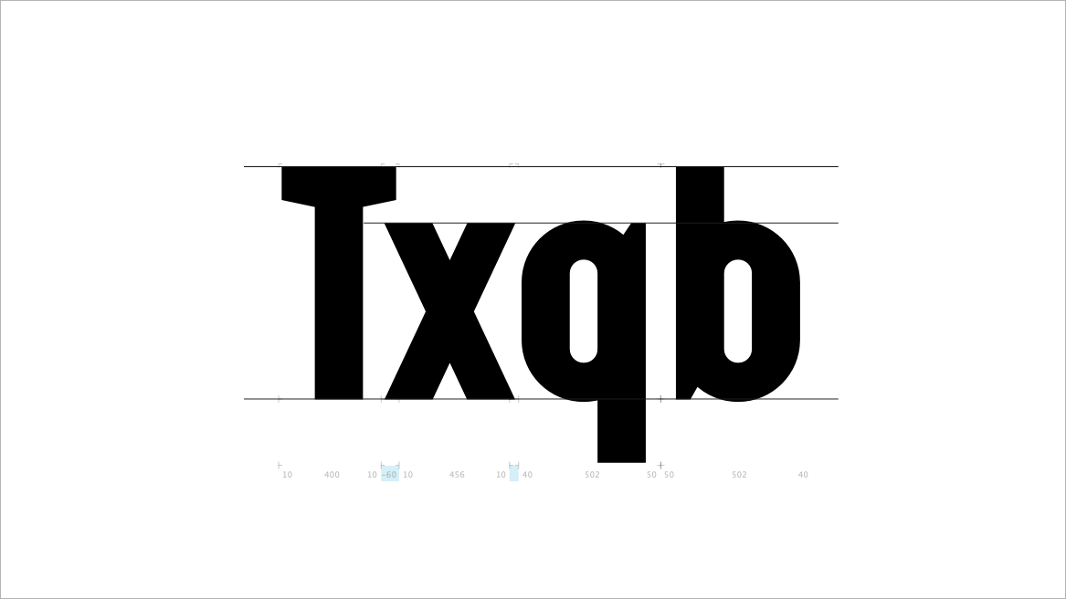
Here are a few basic type anatomy terms you should know. [Typeface: Augmento™ from R9 Type+Design]
3. RESEARCH IS YOUR FRIEND.
When you come across some glyphs you’ve never even heard before (e.g., Thorn (Þ, þ), Eth (Ð, ð), etc.), you should do some research. One of the quickest and easiest ways is to pull between five to ten well-drawn typefaces to see how their designers drew such characters. Chances are you will see different design variations from one to another. However, this trick will give you a general sense of how each particular character should be drawn before you design your own version. I’d also want to recommend a book called “designing type” by Karen Cheng for when you’re ready to dive into even more details. See useful links at the bottom to learn more.
4. TRUST WHAT YOU SEE, NOT WHAT YOU MEASURE.
Type design is a form of visual art. Type designers have been utilizing several optical tricks up their sleeves to create aesthetically pleasing letters, numbers, and symbols. But don’t be surprised if you haven’t noticed them hidden right before your eyes after all these years because these illusions help make the fonts visually consistent. Let’s use the word “HOAX” as an example. If you look at the photo below, you’ll notice that the “H” is set between the baseline and the cap-height line while the “O” is slightly taller and protrude beyond both. This is purely an optical illusion to trick your eyes to think that both letters are actually the same height. If you drew the “O” at the exact same height as the “H,” the “O” will actually appear shorter due to its round shape. The same goes for the stroke width of the “X” when compared with the “H.” If you measure the stroke width of the former, you’ll find that it is slightly wider than the latter. That’s because the leaning stroke appears thinner than the vertical stroke.
![Here are a couple of optical-illusion examples for visual consistency. [Typeface: Aldero™ (Released Date: Fall 2020)]](https://images.squarespace-cdn.com/content/v1/58585f7515d5db68c7ffa7eb/1591698035691-ZOM2TABHIPPMIRR2VXAQ/optical-correction-hoax-overshoot-stroke-width-illusion-typeface-design.gif)
Here are a couple of optical-illusion examples for visual consistency. [Typeface: Aldero™ (Released Date: Fall 2020)]
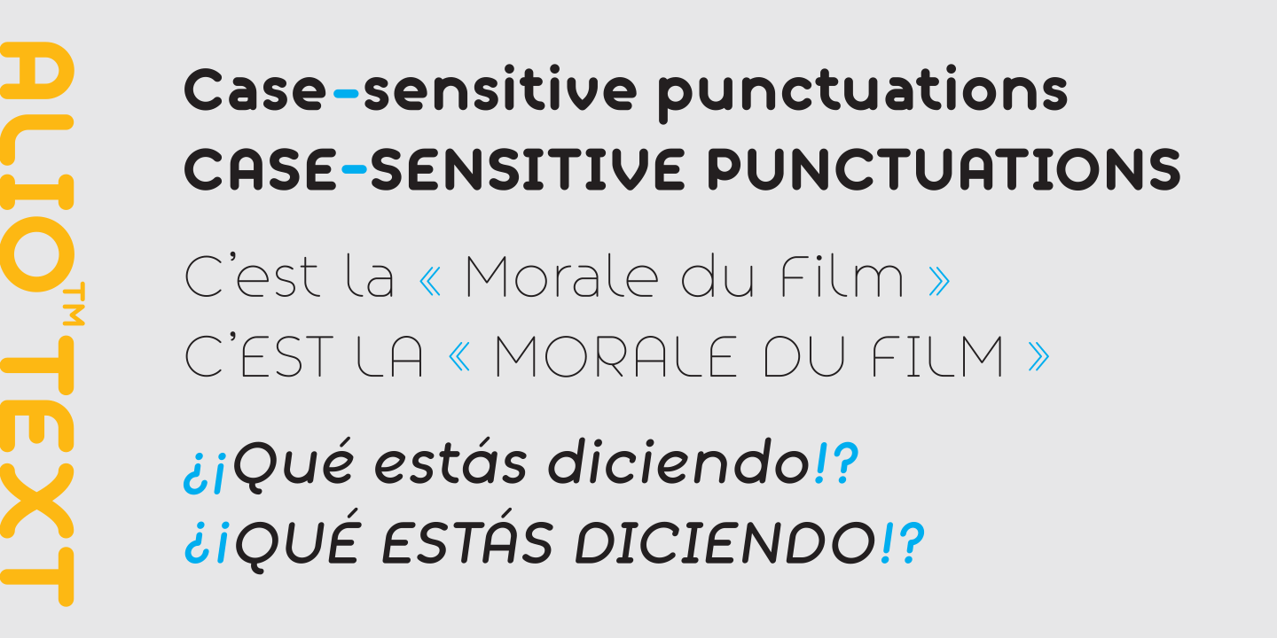
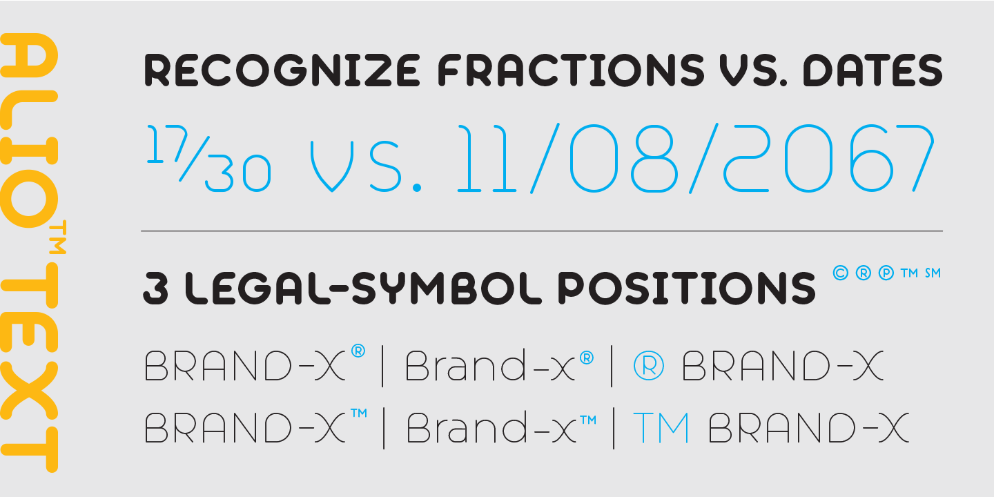
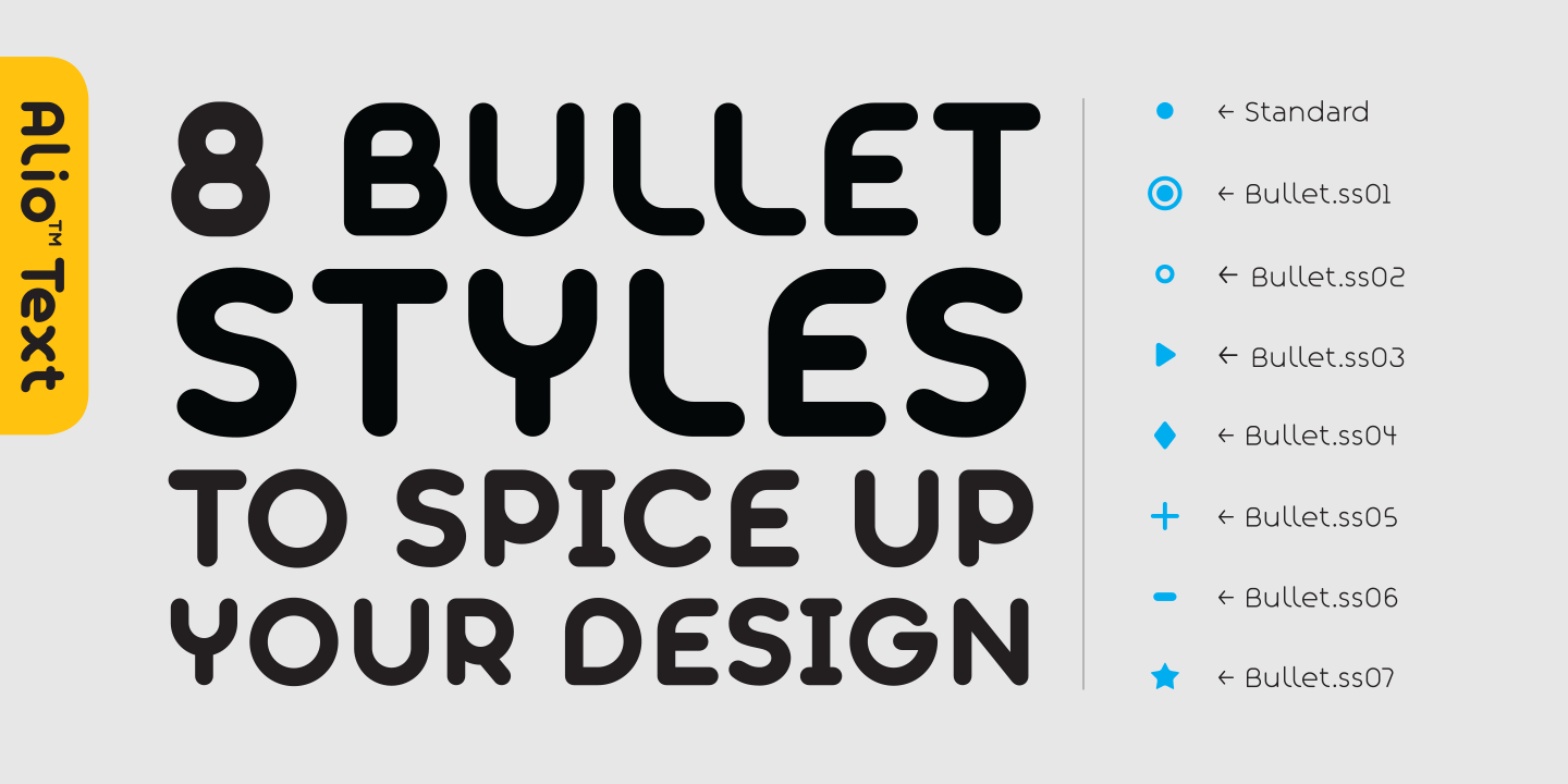
5. IMPROVE YOUR FONTS WITH UX DESIGN.
In this digital age, most graphic designers are quite familiar with the UX design concept. But many are still limiting its use only to designing websites, or mobile app user interfaces. In fact, as type designers, you can implement the UX design on your fonts as well. One of the easiest ways is to make use of Opentype features. Below are a few examples of how we embedded UX design into the Opentype features of our font, Alio™ Text, to help streamline our customers’ workflow and provide more design alternatives.
6. DO NOT SETTLE FOR MEDIOCRE.
Designing a typeface, to me, is not a linear process. Don’t be afraid to take a few steps backward to head into the new and better direction. Trust your design instinct. You may have to draw and redraw characters plenty of times before you’re happy with them. Feel free let the design process grew organically beyond your original intentions and explore uncharted territories. Always keep your mind open and let your creativity flow. That’s how my first typeface, Alio™, ended up expanding into over 700 glyphs and came with its own decorative companion, Alio™ Decor.
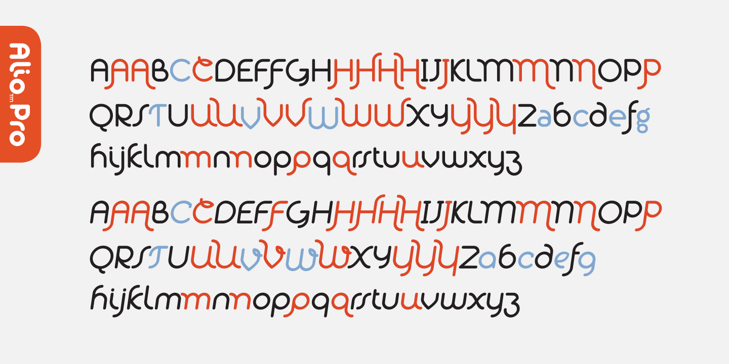
Alio™ Pro comes with over 700 glyphs and supports over 100 languages.
7. BE METICULOUS AND CONSISTENT.
There are plenty of type designers in the world right now. To set yourself apart, you must work harder, and strive to create meticulous work. Make sure you pay attention to small details and carry these design elements throughout. Cubio™ Mono is an excellent example of how we have used the hexagonal shape in all aspects of the entire typeface, be it the design of the letters, icons, or patterns.
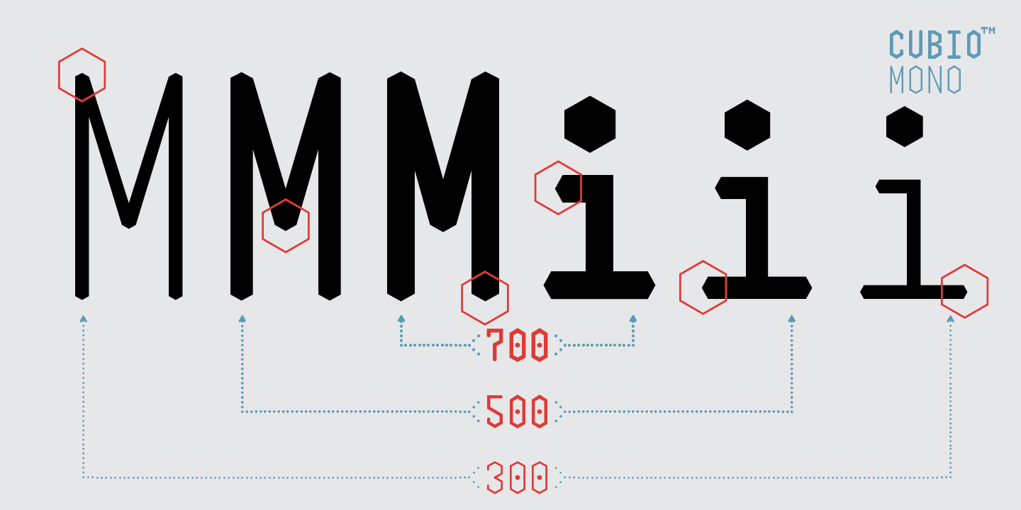
Cubio™ Mono features hexagonal design elements throughout the entire typeface.
8. MAKE SURE YOUR TYPEFACE COVERS THE ESSENTIAL CHARACTER SETS.
If you’re serious about designing your first typeface, you should at least try to cover all the glyphs listed on both essential character sets: the Mac OS Roman (242 glyphs) and Windows-1252 (217 glyphs). Glyphs app has built-in filters to help you identify all the characters listed in both the Mac and Window sets. On top of that, if you are planning on selling them on Myfonts, your typeface must also support their minimum character set of 186 glyphs as well. The good news is that most characters on these three lists are overlapped. Hooray!
All R9 Type+Design typefaces support most languages from Western Europe, Central Europe, South-Eastern Europe, and more (except a few fonts which are sold as LTD versions on the Creative Market). That’s several hundred more glyphs than the essentials. Some of our typefaces even come with icons, decorative elements, and patterns.

MAC ROMAN CHARACTER SET (242 Glyphs) – Typeface: Aldero™
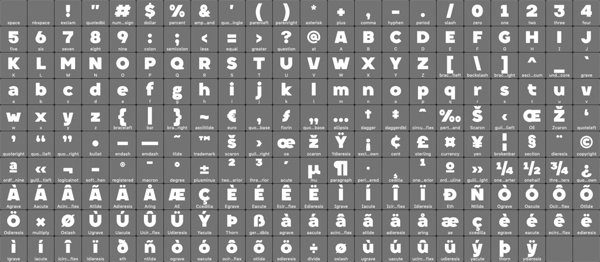
WINDOW-1252 CHARACTER SET (217 Glyphs) – Typeface: Aldero™
Now that you learn some tips on how to design your font. Next post, I will show you more tips and tricks on how to kern them. Be sure to subscribe so you won’t miss it. See you next post!
HELPFUL TYPE DESIGN LINKS:
Type Anatomy – https://visme.co/blog/type-anatomy
Family Stem Weights Calculator – https://www.diacritics.club/family-steps
Diacritics – http://diacritics.typo.cz
Language Support Font Checker – https://hyperglot.rosettatype.com/support
Basic Kerning Text – http://www.as8.it/type/basic_kerning_text.html
Kern King Extensive Kerning Set – https://pangrampangram.com/blogs/journal/kern-king-is-dead-long-live-kern-king-br-the-great-template-for-kerning-types
Make a Font Contact Sheet – https://creativepro.com/make-a-font-contact-sheet-in-indesign/
Typography Blog:
https://ilovetypography.com
http://typomanie.fr
https://www.typewolf.com
https://fontsinuse.com
Forum:
https://typedrawers.com
https://forum.glyphsapp.com/
Free Glyph App Online Course:
https://bit.ly/3gEPR86